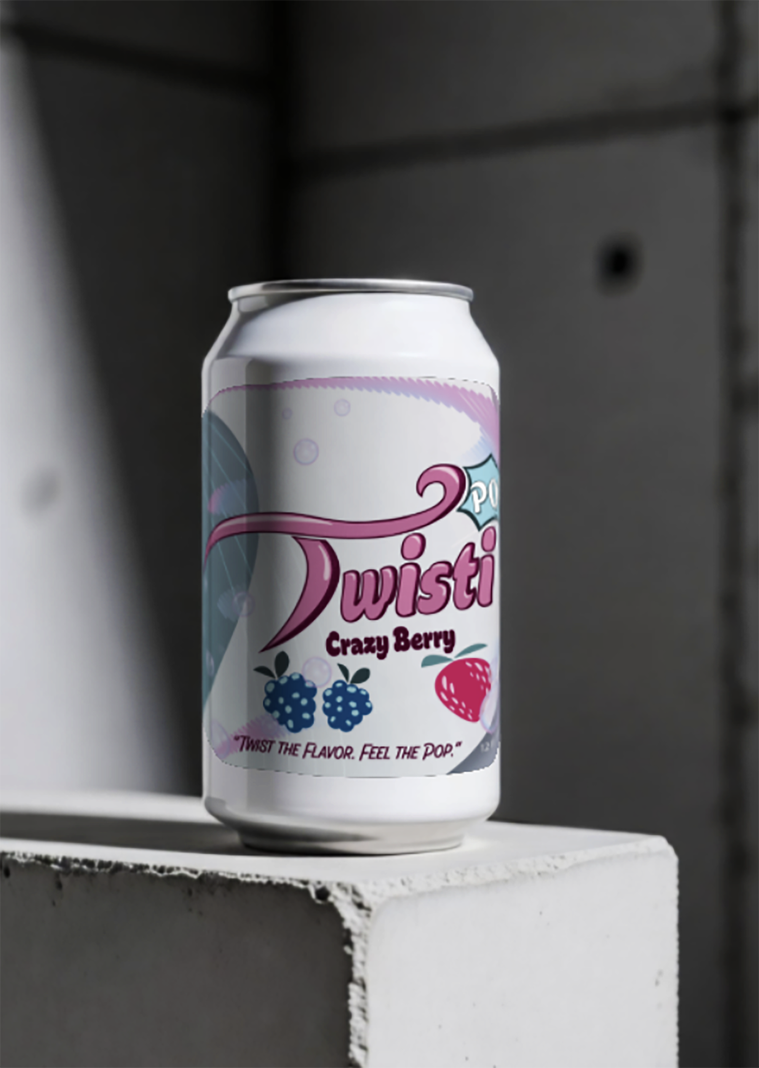
TwistiPop is a twist of flavor soda brand that was made with the intention of drawing attention due to its vibrant color choice and fun bubbly font. I wanted to give this brand a lot of life as it included two words that felt like they resembled action. Going with the curves and the comic style it becomes a cohesive piece for its brand identity.
Twistipop Drink label
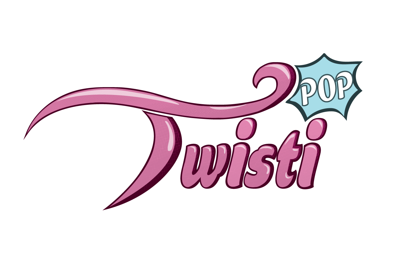
This logo uses the T at the beginning to wrap the text and make the overall logo feel put together without anything being left a stray. The T also has high dynamic curves which drag towards the POP part of the logo.
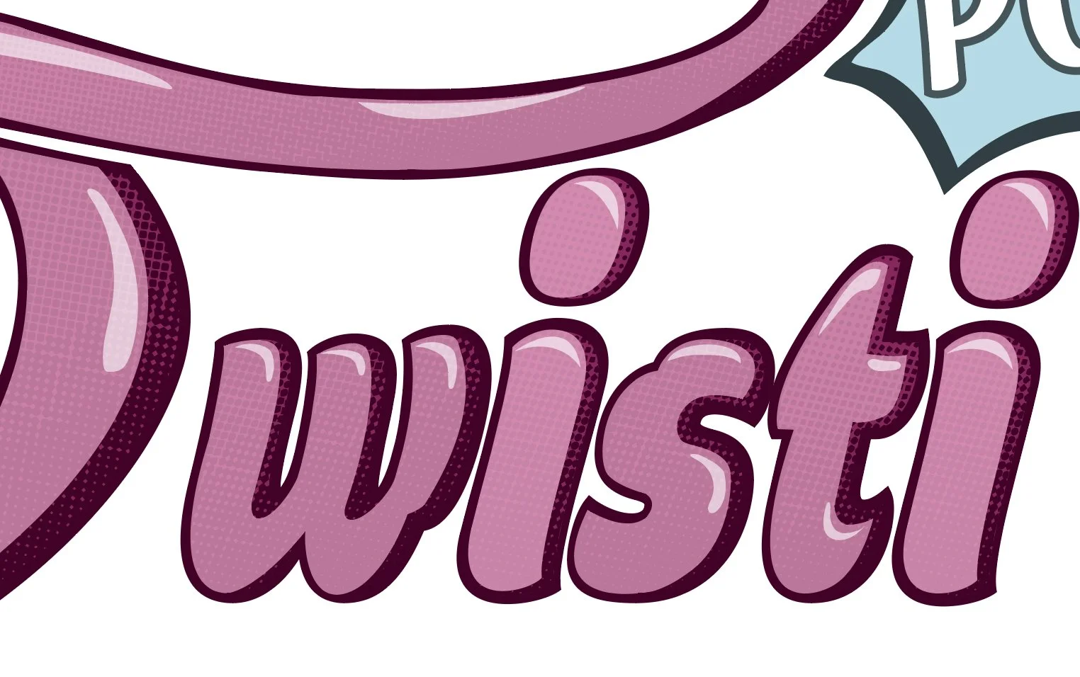
What may seem like a basic bubbly type at first actually has thoughtful detail in the lettering upon further examination. I included a classic dot gradient which can be seen in comic styles throughout time.
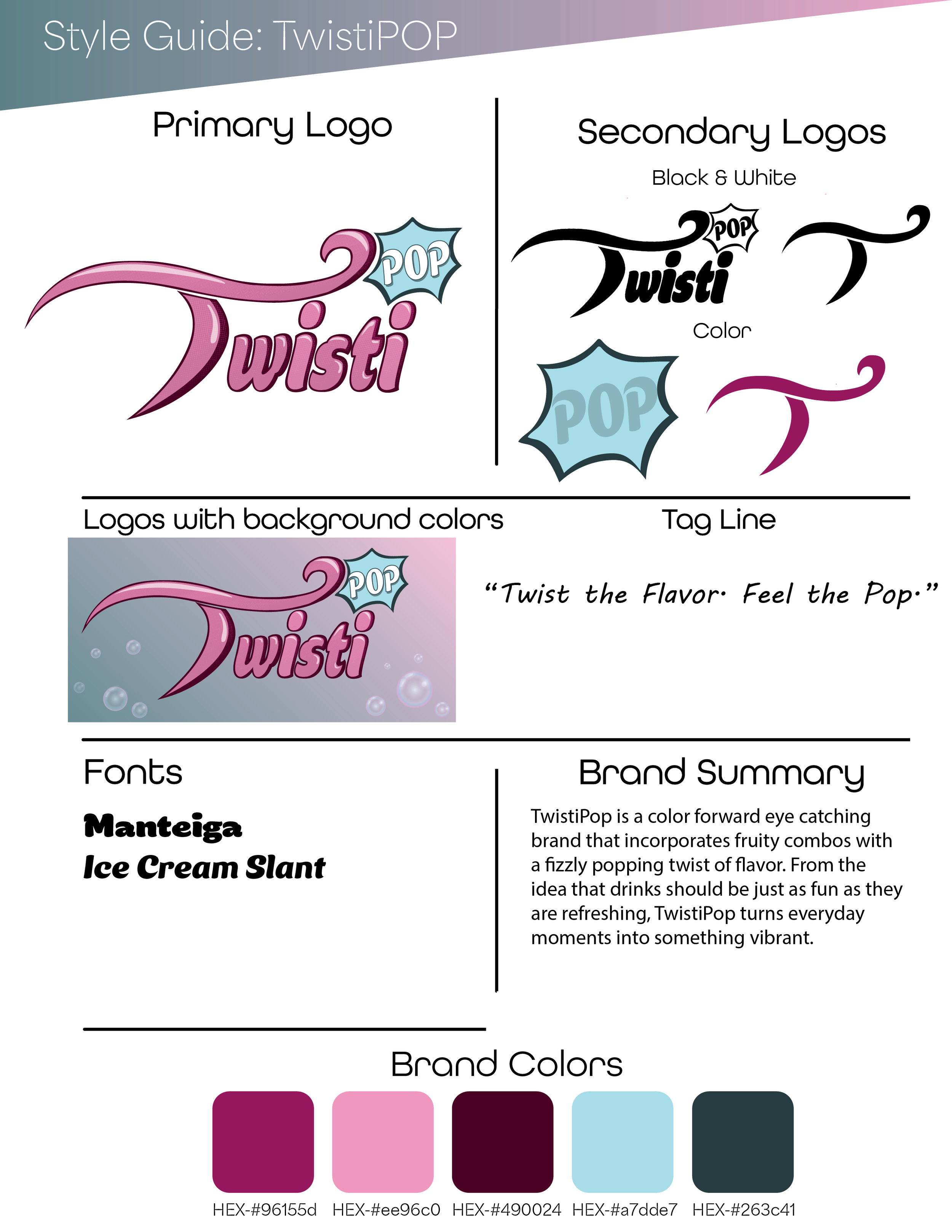
TwistiPops style guide that includes its colors, fonts, and logo variants to build its overall identity.
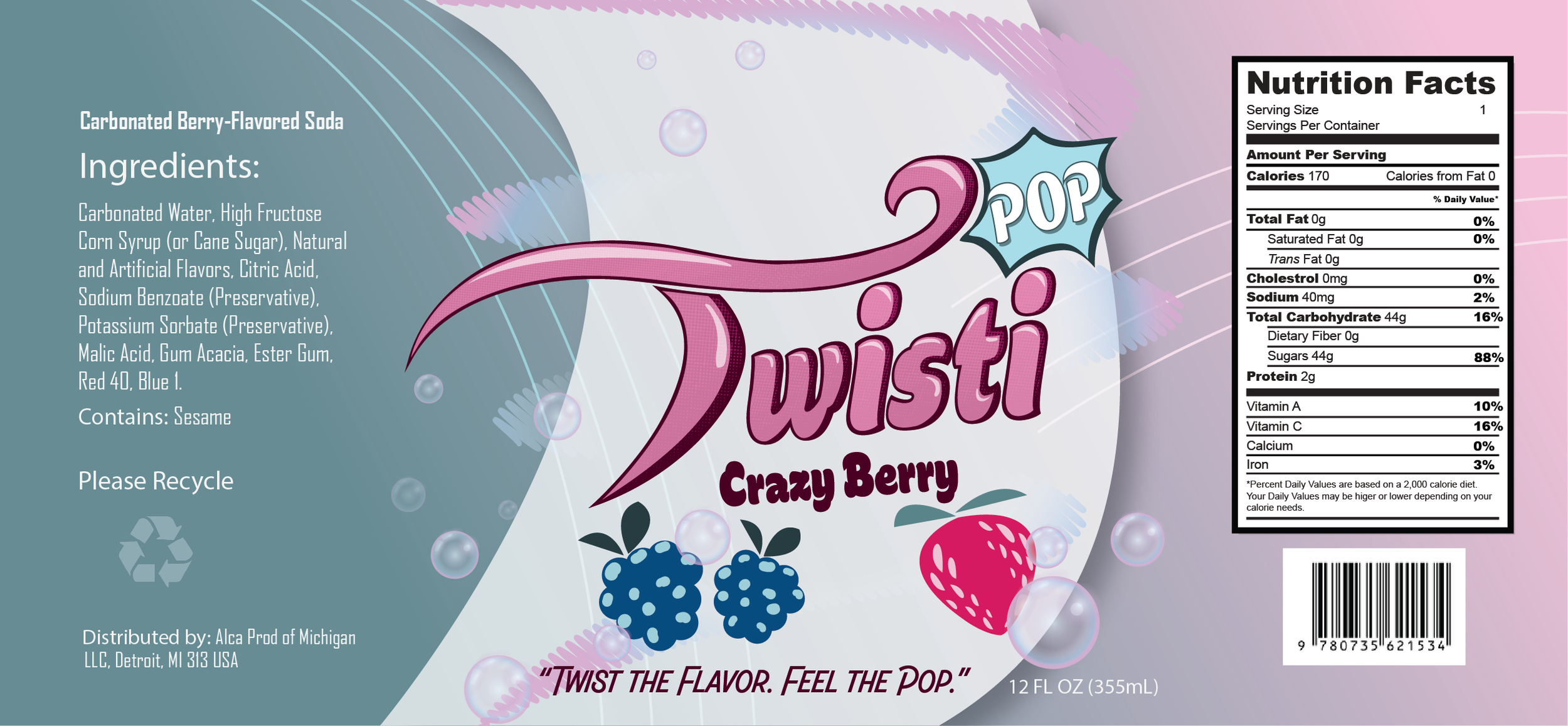
Put together we get a complete logo and label design that feels put together. Including necessary aspects such as Ingredients, nutrition facts, fluid ounces, etc.