
R&W conflict resolution
R&W or in other words Resolving Workplace. Is a brand that works on resolving workplace issues that may arise. The brands whole identity revolves around the theme of work environments and conflicts.
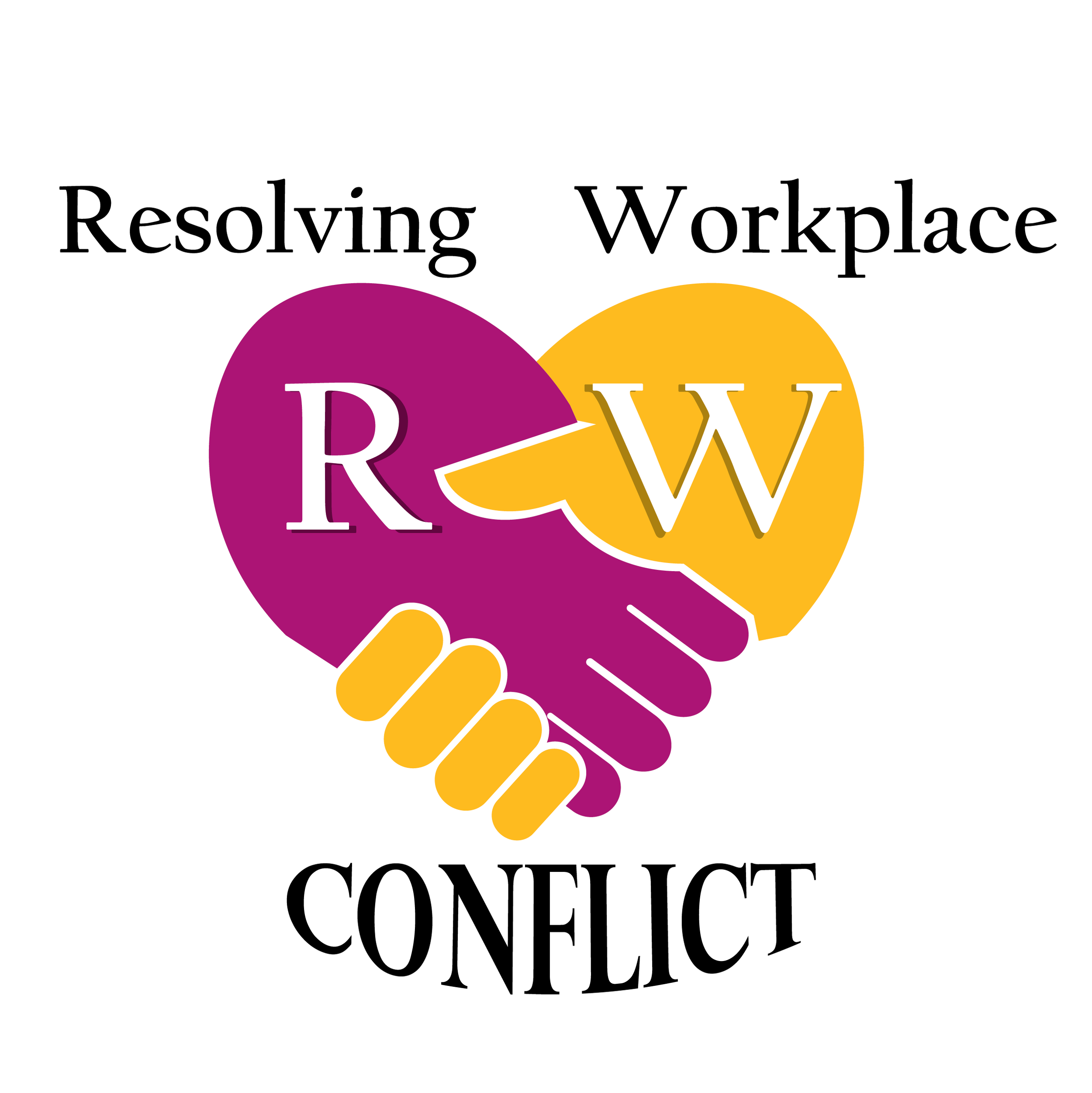
The logo has a couple of important components that make it up. One stand out being that the logo is split in two by two highly contrasting colors. This is intentional because the brand’s purpose is to deal with confliction. So, the use of conflicting colors is a huge factor in making the brand feel more built on something. The R and W are simply the initials of the words “resolving workplace”. This allows for the removal of the text and the use of just the R&W logo to get a similar point across.
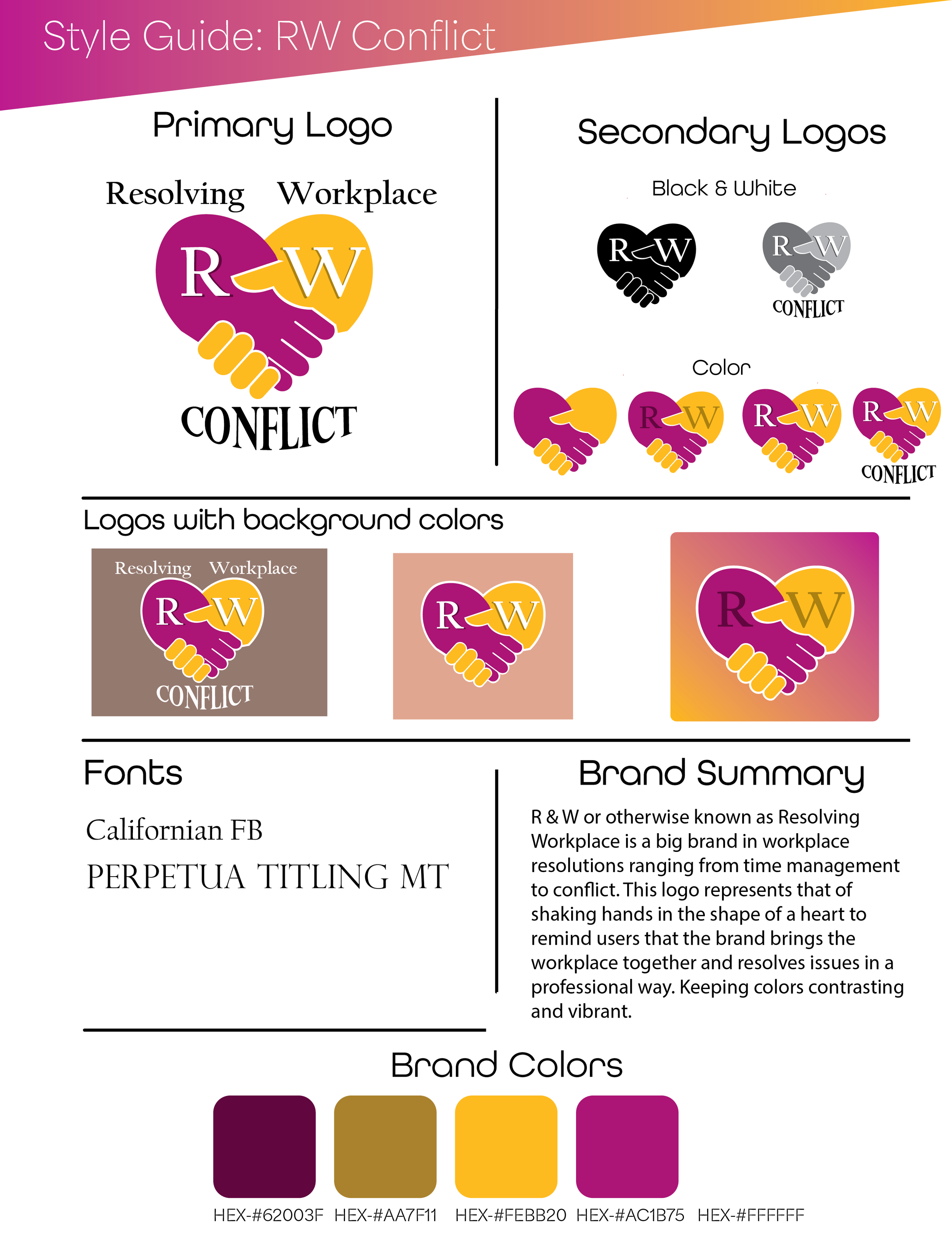
R&Ws style guide showing off variables ranging from font choice to colors to help bring the brand together.
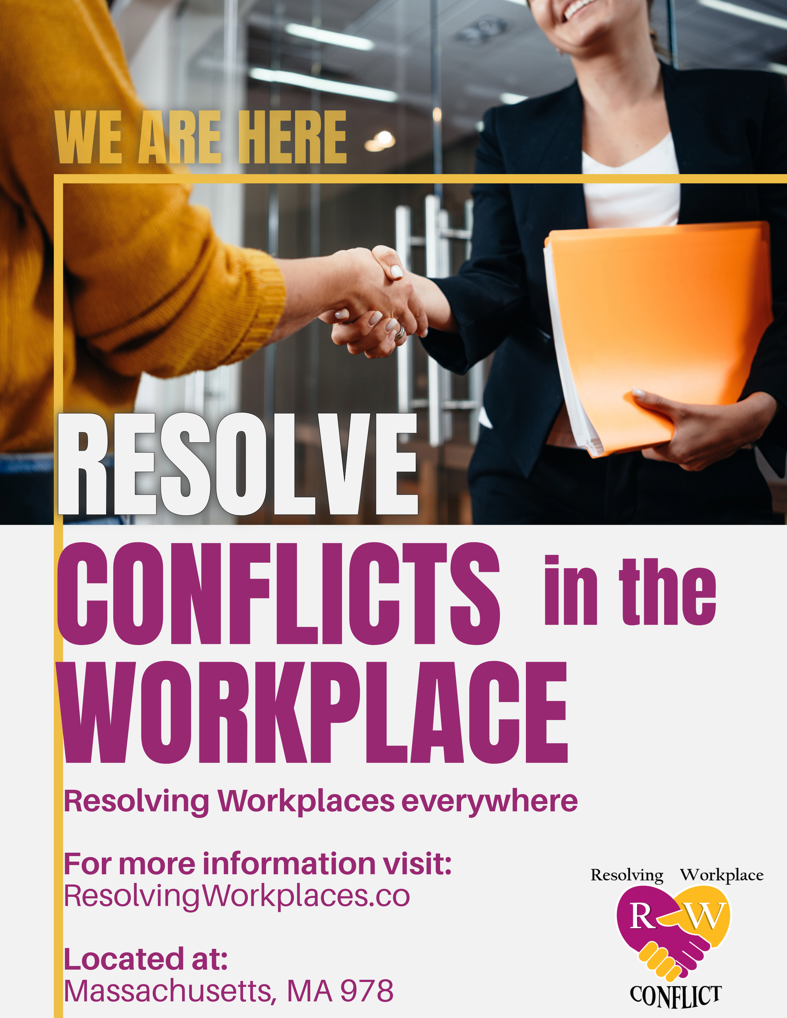
R&W conflict resolution Instagram advert that stays true to its colors and cohesive hierarchy of text.