My Austen Perez Brand
What started as a simple design choice for my initials eventually paved the way for a more refined overall brand identity. Still resembling my initials, the logo eventually underwent several changes in style and colors. The brand represents an aspect of my style as well as incorporating my modern creative take on logos.

The new logo paved way for a more dynamic feel given the distortion to the logo itself creating motion. Color was also added in subtlety to give life and brand identity to the logo. And overall polish on connecting points were added to complete the overall flow of the new logo.

The old logo although passable felt stiff and lacked identity and color that correlated to the brand. It also had a white outline that was deemed unnecessary.
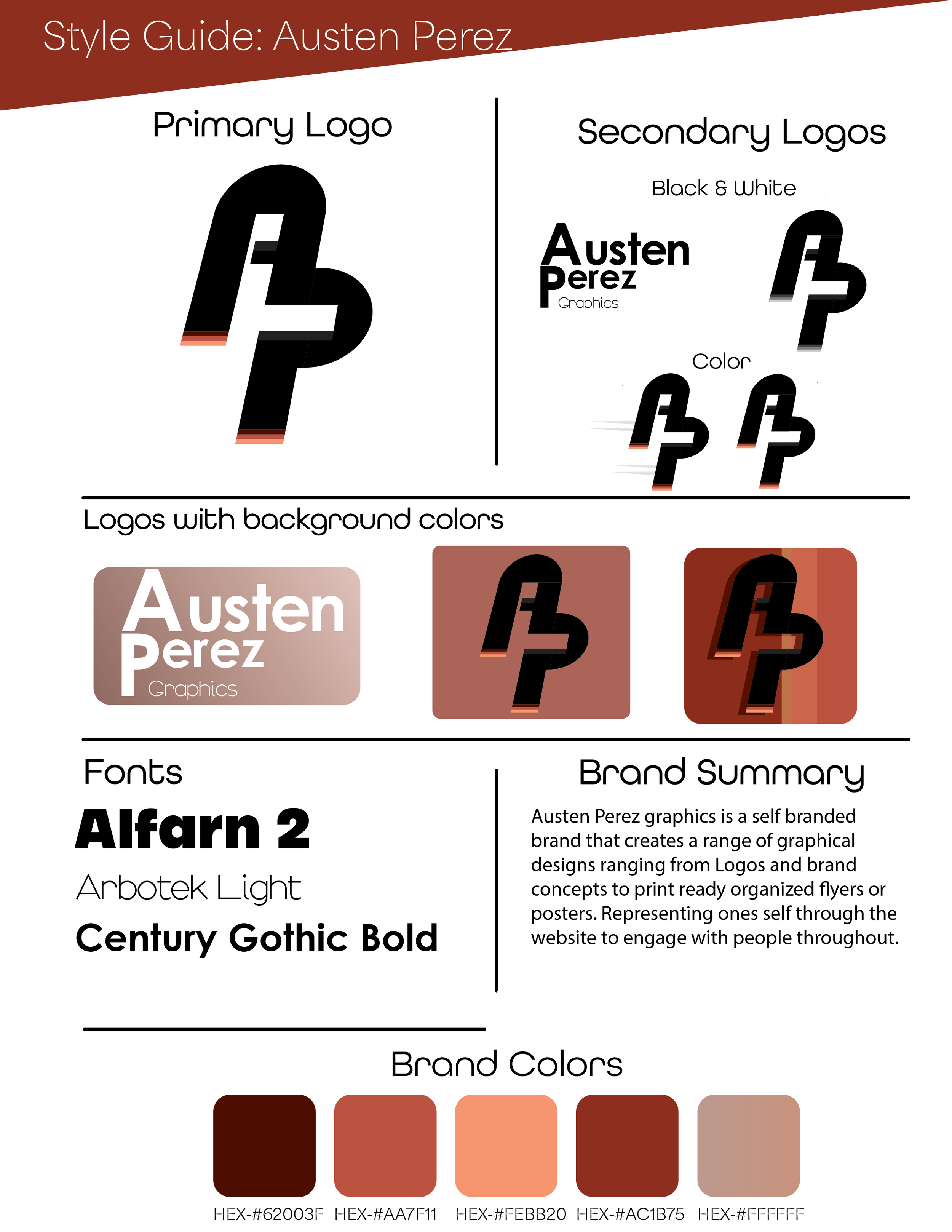
The Style guide for my brand includes the brands colors, black and white variants as well as fonts that build the brand.


The business card also incorporates the brands identity as expressed through the colors from the style guide. With a mix a grey toned red hued background it completes the overall brand.

Shown here are two previous iterations of the business card before not only growing with the programs but also after reassessing what was needed to further escalate the feel that I was going for and refining the overall aesthetic.