
Norfair Luxury brand
NORFAIR is a luxury modern brand that was created to represent that of other leading competitors. Its purpose was to remain simple yet complex feeling enough to give it a luxury edge that may drag in buyers.
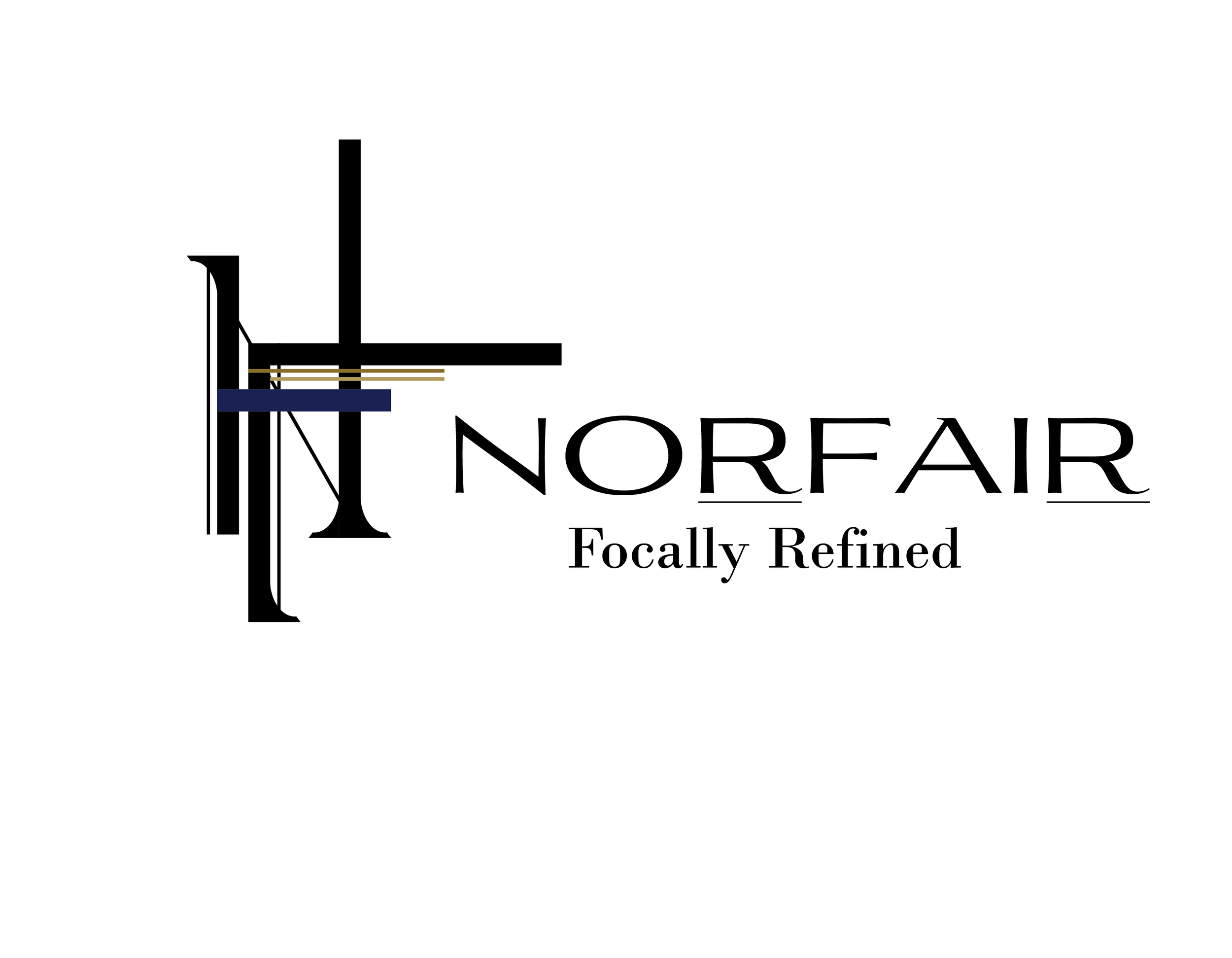
NORFAIRs logo is important for its identity. When observed closer it’s to be noted that the logo represents that of a N and F. This is because the brand name has 2 syllables and both the N and F land on them. Included in small amounts are the brands colors on the inside lines. This helps break apart some of the noise in the middle of the logo with some color while keeping it feeling luxury.
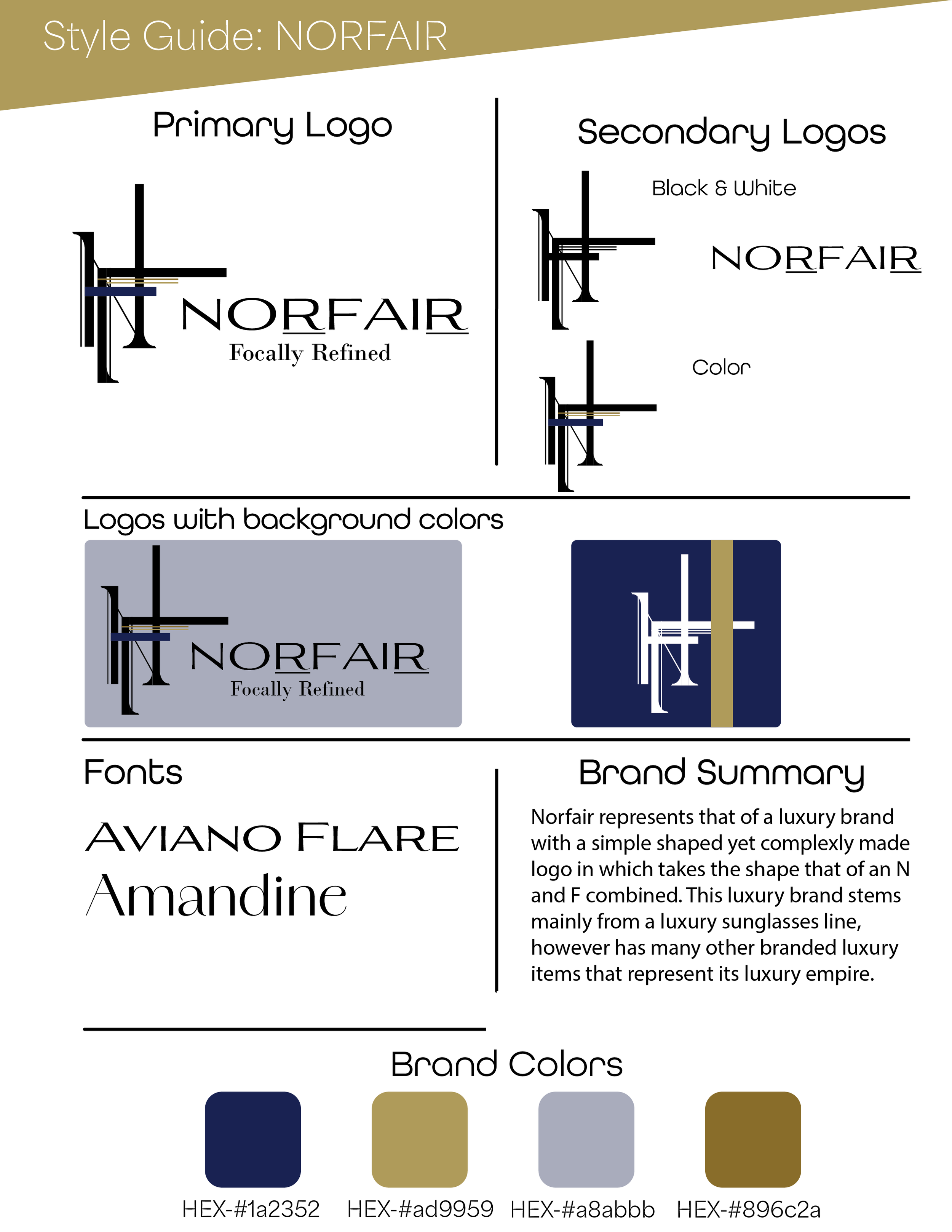
The style guide for NORFAIR includes important elements to help gage at what the brand is meant to represent. From colors to fonts and alternate logos, the style guide offers intel to anyone unfamiliar with the brand.
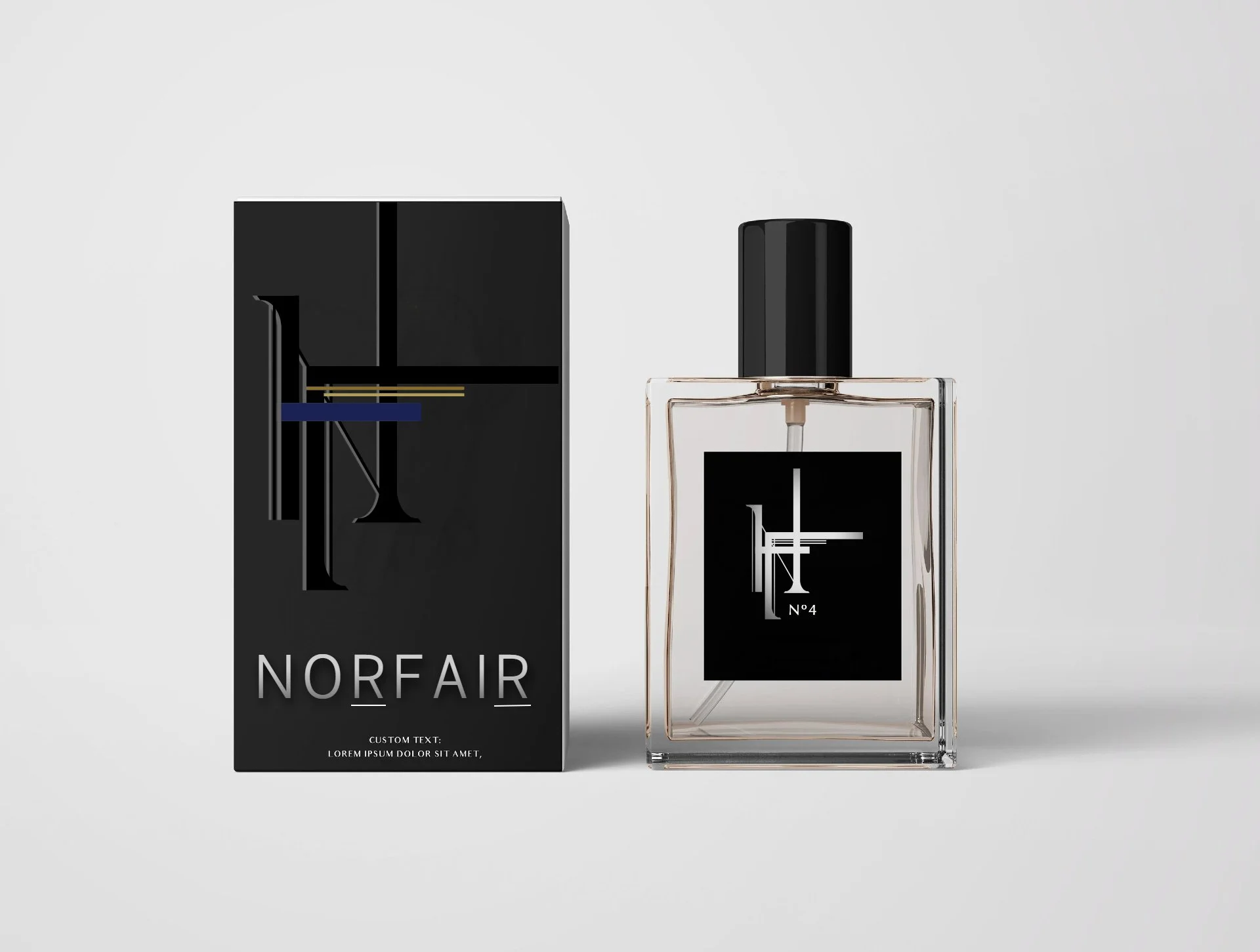
Represented here is a mockup for a perfume label and box that shows off how the brand may feel in a real-world setting.